Monday, May 3, 2010

Strive to Survive

As my Visual Rhetoric course at SJU finally comes to a close, I can exhale my feelings on the course, and inhale a deep, soothing sense of relaxation. Not knowing anything about visual rhetoric or the techno-software being used these days, I entered Dr. Knight’s course blindly, but now, I can say that I at least have an idea, and I understand more than I did beforehand.

For those considering a visual rhetoric course in the future, here are a few tips to succeed and survive:

1.) Pay Attention—not just to the words and text, but everything around you. Heighten your senses and keep your eyes open at all times. If I learned anything, it’s that everything is an image, visually communicating a message.

2.) Open up—don’t sit in your comfort zone, break out. The more you let loose and leave your bubble, the more likely it is you’ll bring something new to the class.

3.) Get Techy—there’s a wealth of technology sitting on the internet, so use it! From presentation designers such as Presentation Zen to basic movie creators such as iMovie.

4.) Find yourself—a TED talk isn’t easy, but you can make it less stressful by finding something that you feel comfortable talking about. Don’t attempt to emulate any of the talks on the TED website. Make it your own.

5.) Take advantage of the vagueness—Dr. Knight lets us pave our own way, and though some stress over it, it is something to treasure. We are not limited in terms of creativity and we are free to experiment.

Go forth and conquer visual rhetoricians!

Sunday, April 25, 2010

New Topic + Sexy Short

Although I thought my first idea would make for a nice presentation, I felt another topic directly correlated with the idea of visual rhetoric. My only problem is that I have so much to talk about, and five minutes is not nearly enough time. Anyway, here’s the “sexy” short:


As a former Communication Liaison for QVC’s celebrity clientele, Mark Chalmers interacted with personalities such as Lebron James and Rachel Ray and incorporated self-representation techniques in his daily interaction to garner their attention—even when their inner diva reared its angry face. Mark resurrects the idea of visual rhetoric through body language and self-representation to employ a powerful communicative tool.

Monday, April 19, 2010

Urban Exploration: A Visual, Artistic Form of Preservation

There are those of you who may be aware of my fascination with Urban Exploration, and some of you may not be. For those of you who aren’t, or don’t know what it is, it is what I have chosen as the topic for my TED talk.


Urban exploring is the art of exploring relics—abandoned factories, sanitariums, theme parks, and other colorful landscapes. These remnants litter the landscape of our country, yet most people know nothing of them. That is where I come in.

As a former member of an Urban Exploration team, I investigated ruins and decaying buildings and probed them for personal intention— the hellish scare, sheer joy of discovery, to capture a photograph, or to simply say to other Urban Explorers, “Yeah. I was there.”

For my TED talk, I plan on exposing the world of Urban Exploration with a few personal encounters and preservations, and enlightening you with the vast visual presence this art form has on the internet. The entire carnival of exploring a ruin revolves around its history and preserving it. Like I said before, many are abandoned and decaying, and in time, they will eventually die or be torn down with the growing expansion of new properties.

So we as Urban Explorers make it a point to capture these places with photography. For those who have the chance to visit, photograph, and then post their findings on the internet, they have now exposed and educated an audience on something they might have never known before.

A motto among explorers: if you go somewhere, bring something back.

For more information on Urban Exploration, check out Weird New Jersey.

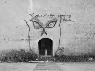
Pictured above: The entrance to a satanic temple, The Paulinskill Viaduct

Monday, April 12, 2010

Simply Awesome

Awesome. What else can I say? Every project presented was simply awesome. I say this because everything was fresh, outside our realm of knowledge, and enjoyable to watch/listen. And to top it off, everything related to the all-important theme of visual rhetoric. Each of us told a story through our images, and to me, we each effectively conveyed a message or story with the use or little or no words.

A few projects that are still lingering in my mind...

Julie's Story of a Writer, which should earn her an A in the class by itself. It was professionally executed, and resembled the example videos we watched prior to completing our assignments.

Sara's video montage of the 9/11 Teardrop Monument was a respectable, emotional timeline of the construction and appearance of an incredibly unknown tribute to those who died in the 9/11 attacks. The mix of music and images caught my eyes and ears and hooked me from the very beginning.

Though Matthew didn't believe his Meaning Making photos had the flash of some other projects, his theme of random things not often noticed or seen around Philadelphia was different from others, and some of the images were strange or odd enough to capture the essence of things we often miss everyday in our busy lives.

The Path of Estro

I've always had this odd dislike for corporate branding, and at some point years ago, I knew it was just a matter of time before it infected something important to me, such as running. It's not just an activity anymore though-- it has spawned a "lifestyle" of activewear clothing. No longer is a Nike headband used to soak up the sweat exerted during a draining exercise or sport-- it's part of a lifestyle of clothing, and it's now acceptable to where whenever.

Truthfully, there's nothing wrong with it, but for some reason, it just bothers me. Perhaps it's because the branding of myself isn't something I look to do while running. I don't need to show off a swoosh or set of stripes or Underarmor "U" because it doesn't help me-- what gets me to the finish line is my passion.

Coincidentally, the last photo of my essay reads the word, "estro"-- Greek for passion. It wasn't something planned, but as I laid on the gravel, and the shirt laid in front of me, I noticed just the estro of livestrong displayed. It was a pure coincidence, but fit the scene just right.

Below is my photo essay in full.


Monday, March 22, 2010

In Time, What It Is becomes What Is It?

Lynda Barry’s What It Is is what I needed, as a writer and as a maturing adult. I’m a believer that as we grow older, we leave behind the playful antics of our childhood, and we become caught in-between the harsh responsibilities and realities of life. And in doing so, we sometimes look at existence as more of a burden than anything.

But when you’re an artist, I think there’s a struggle.

There’s a tug-of-war between our imagination and what’s truly happening in this world, and though we are all pulling on the side of the imagination, sometimes reality wins, and we forget about the things that made us writers, like our dreams, our childhood fears, and what we cooked up in our minds. When I read through What It Is, it reminded me of my own childhood, one page after another, and what led me to becoming a writer. I, for one, never want to truly grow up, and I cling harder to my childhood probably more than anyone I know. If I could, I’d wear onesies all day.

But I can’t.

I have responsibilities, like a job, and sometimes, they keep me from releasing some amazing ideas—like wearing onesies all day. In a more serious tone though, Barry’s book brought me back to my childhood, and posed questions that I haven’t thought about since I was a child—such as. “What is fog?” on page 139 or “What would you like to be good at?” on page 74.

I suppose that in a weird way, Barry’s words and illustrations help me access an area of thought I haven’t been to in quite some time; and unfortunately, these questions are harder to answer now than if I were 7 or 8 years old. From a writer’s perspective, answering “What is fog?” now wouldn’t capture everything my imagination was once capable of.

But I suppose I shouldn’t let that stop me from trying.

Photo: Courtesy of Edupics

Thursday, March 11, 2010

First Attempt at Electric Images

Some electric images I created recently; though for some reason, I'm having major trouble with sizing. I'll see what I can do about that.

The picture above was actually edited in Adobe Photoshop. One of my favorite music albums of all time is Something Corporates "North" and the cover was created in the same light with the actual picture being masked by a few like colors as if it were painted that way. The picture, for those wondering, is actually me receiving a trophy for winning a pillow fight tournament. It's a roadside traffic cone.


I love going on urban exploration trips, and this picture is the graffiti over the entrance to a satanic temple in New Jersey. I used sumopaint for this one, and I used the negative of a half-tone scheme with a squared pattern. I may change it though, because it doesn't capture the writing on the wall, which says, "You're Never Coming Back."

This is from another urban exploration trip I recently went on. It's the road sign on Shades of Death Road. I can't seem to remember the scheme I used in sumopaint, but it wasn't the negative. I'll keep looking.

This the outside of the satanic temple, which is actually located in a viaduct, which is a hollowed bridge with catacombs and rooms inside. I'm still playing with this, so I'll post a new version before class on Tuesday.


Thoughts on Until the End of the World

After watching the second half of Until the End of the World, I think I finally grasped the importance of colors and visuals in the film. A few things caught my eye, such as the concentration on black, red, and blue—namely the lab-coats. The father wore black, which is obviously a symbolic color of an antagonist; the mother and Claire wore red (also, the picture of a child wearing a red shirt stood on a table next to the bed); and the team of scientists wore blue.

The cave itself also masked a red and blue undertone. Some walls in the laboratory carried a faint blue, while the untouched rocky walls carried a red. The cave itself is also a symbol as the entrance showcased multiple cave drawings, while the heart of it encased the laboratory where dreams were formulated.


When the dream sequence occurred, the picture on the monitor resembled satellite disruption, which could be associated with the nuclear satellite orbiting Earth at that point and time.


Also, the DVD cover above is pretty sick. Courtesy of freshwap.net.

Monday, March 1, 2010

It's really hard to comment without seeing the movie, but I'll try.

Unfortunately, I was stranded at work last week, taking care of everything that my office feared would fall behind with the coming of the so-called “Snow-mageddon II”. And because of my absence, I missed out on much of Until the End of the World. Two Blockbuster stores served me a heaping plate of nothing in my attempts to find the film, and so this writing comes with viewing just a few short clips and seeing a number of pictures. Plot aside, the visuals of this movie seemingly include a variable of camera angles and quality, posing scenes as more than just characters conversing; they serve as artistic stimulants, and keep the transition from scene-to-scene fresh and entertaining. After I watch the remaining parts of the movie, I will be able to comment further on the visual stimulants of the film. Not understanding the plot and only being able to view sporadic bits and pieces obviously makes it difficult to comment.

Monday, February 22, 2010

I am simultaneously watching HOUSE, so I can't really think of a title right now.

Like many of my classmates, I expected a film with a name like Helvetica to be boring, monotone, and dull. I even had a great joke lined up for it, or, more like a line: Helvetica? More like HELLvetica. But, I must say, I couldn’t have been more wrong.

I found Helvetica to be extremely interesting, namely the use of the font in Europe, as well as the incredible surge in its usage when it first became available. I don’t think many of us have ever noticed the number of corporations using Helvetica, yet each one stood out and portrayed a unique message with italics, colors, and shades of boldness.

All this talk of Helvetica almost makes me wish I could convert the font of my blog! Sadly though, it isn't possible.

Sunday, February 21, 2010

the search


Monday, February 8, 2010

Thoughts on Maya Deren's Meshes of the Afternoon

I think there are two avenues of cinematic presentation: one— strictly thoughtless, where everything about the story is given to viewers; or two— thought provoking, which propels viewers to take attention to details amidst sometimes massive confusion. As I watched Maya Deren’s Meshes of the Afternoon, it became apparent that her experimental film was one down the second avenue.

Continuously, images were repeated—the knife, the mirror, the headset left off the phone, the flower—and it was nearly impossible to watch and not search for some kind of symbolic undertone for each one. Thinking of these images, one after another, made me think back to Deren’s essay we read in class—Anagram. I remember Deren talking about humans and animals, and the basic difference between us is that we do not do most things by instinct, but how grow through experience; and that our basic natural faculty of rationale is something that is both a useful tactic, as well as something that drives us batty.

We want reasons, excuses, and logic as to why things happen. When Deren noted that we hold a natural faculty of rationale, I realized it is quite possible that her films, such as Meshes of the Afternoon, were created to make viewers think: why is there a knife? What does the mirror mean? Why do the scenes repeat? Personally, I feel Deren’s film is meant to play with our minds and that same natural faculty of rationale. I think we are not meant to find an answer, but rather, to spend limitless time trying to make something out of nothing. But then again, that’s simply my interpretation.

Saturday, February 6, 2010

the Pomegranate (phone)

Check out the sleek and super-multi-functional Pomegranate phone. Browse through each of the incredible features, then once you've seen them all, click "I've seen enough" or "Release Date." You'll be somewhat amazed.

Photo: Courtesy of Communications Nova Scotia

Saturday, January 30, 2010

Seeing is Believing: Visual Communication

The question of “What is visual rhetoric?” has been somewhat plaguing me this week— not like a non-stop sort- of thing, but rather just a here and there type. I can’t say I’ve struggled with formulating an answer…maybe tangled is a better choice. As a paced my feet during a seven mile run through the stifling cold streets of Philadelphia this morning, I made several attempts at cracking this question. By the end of my run, I came to a simplistic conclusion—one that may or may not be the actual answer, but rather, my own interpretation of it; it’s merely a form of visual communication.

That’s it? Well, no. Like all definitions, it’s merely the surface, with much more sitting beneath. Visuals, like words, require the same type of analysis. For instance, our in-class exercises required us to look a little deeper into the changes of several corporate logos. Those who designed them didn’t merely draw them for the sake of being noted as pretty pictures; they designed them with certain ideas in mind, such as what they wanted the reader to believe about the company based on first impressions, and what kind of inviting connections would be made between the company and the consumers.

How we reacted to the pictures in class is similar to how we interpret text. We often stare endlessly at the words, searching for something a little deeper. We Google, pull out a dictionary, or put it away and return to it when we have clearer heads. Images may conjure the same reactions, and perhaps more. Picture and video can invoke emotions; so can words, of course, but visuals bring out something else in us—like Steve McCurry’s portrait of the Afghan Girl in the June 1985 issue of National Geographic, or the multiple angels of footage featuring jets flying into the World Trade Center.

We are living in a visual age, where pictures and video capture our attention and emotion differently than text. Visuals are effective, and impact what we do, how we feel, and what we believe. I think our readings from this past week are meant to convey that message. Somehow, we all seemed to connect to one another during our presentations. We referred to each other’s points, built our ideas upon other readings, and developed conclusions as a whole.
Visual Communication Example: Vaguely, I remember reading an example from John Berger, a media theorist, during my undergraduate critical thinking seminar. He used the example of a circle. Try describing it. Draw it. Which one is easier to remember?

Photo: Property of National Geographic. Top photo, Steve McCurry © National Geographic Society.


Monday, January 25, 2010

Class Reading Recap...Extended

Jeffrey Keedy’s Graphic Design in the Postmodern Era was intriguing for me. As someone who has never been educated on the friction of modern versus postmodern, I found it eye-opening—eye-opening as it pertains to my experience in mass communications, and how little I truly learned—history-wise and theory-wise, and I wonder if it is a generational thing. Keedy says, “With all the confusion in these early days of formulating theoretical paradigms, it is understandable why some designers have given up trying to connect their practice to contemporary theory.”

The first thought that enters my mind is a reflection—a reflection of what my graphic design courses included. There was no history. There was not theory. It was merely instruction, lessons on chromatics and page layout. This is Adobe Photoshop. This is what the magic wand does. This is Adobe Illustrator. There were no lessons on types or anything. After reading this, I almost feel robbed, as though I missed some incredibly important things—not because of class time constraints or the level of the course, but perhaps because those in the field who taught me didn’t believe in correlating practice with theory.

In terms of the postmodern era, I feel as though Keedy’s interpretation of postmodernism as it relates to graphic design is the constant need for relevance, and the arms race for technology. As Keedy says...”Today's young designers don't worry about selling out, or having to work for "the man," a conceit almost no one can afford anymore. Now everyone wants to be "the man." What is left of an avant-garde in graphic design isn't about resistance, cultural critique, or experimenting with meaning. Now the avant-garde only consists of technological mastery: who is using the coolest bit of code or getting the most out of their HTML this week.”

Keedy goes on to say,” Graphic designers are caught up in a media stream that is very wide and fast, but not very deep. The only way to navigate in it is to go faster or slower than the stream. To go faster you must be at the forefront of technology and fashion, both of which are changing at an unprecedented rate.”

I think it’s incredibly important to note that Keedy’s article is from 1998, which I believe, makes it just as interesting to read. Though only 12 years old, technology has changed—so much in our world has changed, and in graphic design, it’s obviously no different. From a critical standpoint, we should consider what the internet has done. It has opened unprecedented doors for everyone with access. Anyone can write and publish online. Keedy nearly sounds like he is predicting the future when he says, “Perhaps the Internet will simply co-opt graphic design, incorporating it into its operating system. Maybe graphic design will cease to exist as a discreet practice and just become another set of options on the menu.” Anyone can film and upload online. Anyone can create music and perform online. Anyone can design a graphic and post online. Artistry has changed dramatically because of the internet.

So the landscape has changed completely, and with that being said, does it change Keedy’s idea of what postmodern graphic designs stand for? Keedy mentions how the design of the 80’s devolved into the “ugly, grunge, layered, chaotic, postmodern design of the 90s. This devolution resulted in “one-style-fits-all commercial signifier for everything that is youth, alternative, sports, and entertainment-oriented.” As Keedy kindly put it, the "official style of the hip and cool"

My final interest of Keedy’s piece included the overall outlook or impression of graphic artists and their work. Keedy says, “Looking at much of today's graphic design one would have to conclude that graphic designers are twelve-year-olds with an attention deficit disorder. Designers today are representing our present era as if they were using a kaleidoscope to do it. Or more precisely, a constantly mutating digital collage machine, filled with a bunch of old "sampled" parts from the past, and decorated with special effects. Ultimately what we are left with is a feeling of aggravated and ironic nostalgia.”

My reaction to this statement is that of disagreement. I feel technology has bestowed upon designers a new set of tools, and a slew of new ideas to use. So my question to you, is this: Is Keedy right? Is graphic design today a constantly recycled kaleidoscope of the past? Do we see anything new in advertising, or is it what we’ve seen so many times over?

Sunday, January 24, 2010

TED Talk: Alexis Ohanian, How to make a splash in social media

It's funny. It's enlightening. It's motivational. Alex Ohanian, co-founder of Reddit, explains the social media phenomenon of Mr. Splashy Pants and the use of social media as a tool for positive change. Hmmm...using facebook/twitter/reddit for things other than stalking and procrastinating...that actually makes sense.

Courtesy of TED.com: Ideas Worth Spreading

Class Reading Recap

Jeffrey Keedy’s Graphic Design in the Postmodern Era is a worthwhile, enlightening read that perhaps bestows upon the reader more insight into the world of graphic design than most college level courses. Keedy’s 1998 article discusses the state of the artists—both in modernism and post—the work being done, the history, and the public reaction to the work. He dives into his personal experiences in the business, and even comments on his own awesomely designed typography, Keedy Sans (pictured).

It’s a read that goes beneath the pencil and draft paper— or perhaps better said for these times, below the Photoshop canvas. Check out the text at Émigré Essays.
 
Copyright 2009 the flux. Powered by Blogger
Blogger Templates created by Deluxe Templates
Wordpress by Wpthemescreator