Thursday, March 11, 2010

Thoughts on Until the End of the World

After watching the second half of Until the End of the World, I think I finally grasped the importance of colors and visuals in the film. A few things caught my eye, such as the concentration on black, red, and blue—namely the lab-coats. The father wore black, which is obviously a symbolic color of an antagonist; the mother and Claire wore red (also, the picture of a child wearing a red shirt stood on a table next to the bed); and the team of scientists wore blue.

The cave itself also masked a red and blue undertone. Some walls in the laboratory carried a faint blue, while the untouched rocky walls carried a red. The cave itself is also a symbol as the entrance showcased multiple cave drawings, while the heart of it encased the laboratory where dreams were formulated.


When the dream sequence occurred, the picture on the monitor resembled satellite disruption, which could be associated with the nuclear satellite orbiting Earth at that point and time.


Also, the DVD cover above is pretty sick. Courtesy of freshwap.net.

Monday, March 1, 2010

It's really hard to comment without seeing the movie, but I'll try.

Unfortunately, I was stranded at work last week, taking care of everything that my office feared would fall behind with the coming of the so-called “Snow-mageddon II”. And because of my absence, I missed out on much of Until the End of the World. Two Blockbuster stores served me a heaping plate of nothing in my attempts to find the film, and so this writing comes with viewing just a few short clips and seeing a number of pictures. Plot aside, the visuals of this movie seemingly include a variable of camera angles and quality, posing scenes as more than just characters conversing; they serve as artistic stimulants, and keep the transition from scene-to-scene fresh and entertaining. After I watch the remaining parts of the movie, I will be able to comment further on the visual stimulants of the film. Not understanding the plot and only being able to view sporadic bits and pieces obviously makes it difficult to comment.

Monday, February 22, 2010

I am simultaneously watching HOUSE, so I can't really think of a title right now.

Like many of my classmates, I expected a film with a name like Helvetica to be boring, monotone, and dull. I even had a great joke lined up for it, or, more like a line: Helvetica? More like HELLvetica. But, I must say, I couldn’t have been more wrong.

I found Helvetica to be extremely interesting, namely the use of the font in Europe, as well as the incredible surge in its usage when it first became available. I don’t think many of us have ever noticed the number of corporations using Helvetica, yet each one stood out and portrayed a unique message with italics, colors, and shades of boldness.

All this talk of Helvetica almost makes me wish I could convert the font of my blog! Sadly though, it isn't possible.

Sunday, February 21, 2010

the search


Monday, February 8, 2010

Thoughts on Maya Deren's Meshes of the Afternoon

I think there are two avenues of cinematic presentation: one— strictly thoughtless, where everything about the story is given to viewers; or two— thought provoking, which propels viewers to take attention to details amidst sometimes massive confusion. As I watched Maya Deren’s Meshes of the Afternoon, it became apparent that her experimental film was one down the second avenue.

Continuously, images were repeated—the knife, the mirror, the headset left off the phone, the flower—and it was nearly impossible to watch and not search for some kind of symbolic undertone for each one. Thinking of these images, one after another, made me think back to Deren’s essay we read in class—Anagram. I remember Deren talking about humans and animals, and the basic difference between us is that we do not do most things by instinct, but how grow through experience; and that our basic natural faculty of rationale is something that is both a useful tactic, as well as something that drives us batty.

We want reasons, excuses, and logic as to why things happen. When Deren noted that we hold a natural faculty of rationale, I realized it is quite possible that her films, such as Meshes of the Afternoon, were created to make viewers think: why is there a knife? What does the mirror mean? Why do the scenes repeat? Personally, I feel Deren’s film is meant to play with our minds and that same natural faculty of rationale. I think we are not meant to find an answer, but rather, to spend limitless time trying to make something out of nothing. But then again, that’s simply my interpretation.

Saturday, February 6, 2010

the Pomegranate (phone)

Check out the sleek and super-multi-functional Pomegranate phone. Browse through each of the incredible features, then once you've seen them all, click "I've seen enough" or "Release Date." You'll be somewhat amazed.

Photo: Courtesy of Communications Nova Scotia

Saturday, January 30, 2010

Seeing is Believing: Visual Communication

The question of “What is visual rhetoric?” has been somewhat plaguing me this week— not like a non-stop sort- of thing, but rather just a here and there type. I can’t say I’ve struggled with formulating an answer…maybe tangled is a better choice. As a paced my feet during a seven mile run through the stifling cold streets of Philadelphia this morning, I made several attempts at cracking this question. By the end of my run, I came to a simplistic conclusion—one that may or may not be the actual answer, but rather, my own interpretation of it; it’s merely a form of visual communication.

That’s it? Well, no. Like all definitions, it’s merely the surface, with much more sitting beneath. Visuals, like words, require the same type of analysis. For instance, our in-class exercises required us to look a little deeper into the changes of several corporate logos. Those who designed them didn’t merely draw them for the sake of being noted as pretty pictures; they designed them with certain ideas in mind, such as what they wanted the reader to believe about the company based on first impressions, and what kind of inviting connections would be made between the company and the consumers.

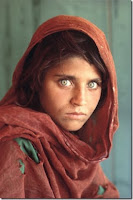
How we reacted to the pictures in class is similar to how we interpret text. We often stare endlessly at the words, searching for something a little deeper. We Google, pull out a dictionary, or put it away and return to it when we have clearer heads. Images may conjure the same reactions, and perhaps more. Picture and video can invoke emotions; so can words, of course, but visuals bring out something else in us—like Steve McCurry’s portrait of the Afghan Girl in the June 1985 issue of National Geographic, or the multiple angels of footage featuring jets flying into the World Trade Center.

We are living in a visual age, where pictures and video capture our attention and emotion differently than text. Visuals are effective, and impact what we do, how we feel, and what we believe. I think our readings from this past week are meant to convey that message. Somehow, we all seemed to connect to one another during our presentations. We referred to each other’s points, built our ideas upon other readings, and developed conclusions as a whole.
Visual Communication Example: Vaguely, I remember reading an example from John Berger, a media theorist, during my undergraduate critical thinking seminar. He used the example of a circle. Try describing it. Draw it. Which one is easier to remember?

Photo: Property of National Geographic. Top photo, Steve McCurry © National Geographic Society.


Copyright 2009 the flux. Powered by Blogger
Blogger Templates created by Deluxe Templates
Wordpress by Wpthemescreator