Monday, May 3, 2010

Strive to Survive

As my Visual Rhetoric course at SJU finally comes to a close, I can exhale my feelings on the course, and inhale a deep, soothing sense of relaxation. Not knowing anything about visual rhetoric or the techno-software being used these days, I entered Dr. Knight’s course blindly, but now, I can say that I at least have an idea, and I understand more than I did beforehand.

For those considering a visual rhetoric course in the future, here are a few tips to succeed and survive:

1.) Pay Attention—not just to the words and text, but everything around you. Heighten your senses and keep your eyes open at all times. If I learned anything, it’s that everything is an image, visually communicating a message.

2.) Open up—don’t sit in your comfort zone, break out. The more you let loose and leave your bubble, the more likely it is you’ll bring something new to the class.

3.) Get Techy—there’s a wealth of technology sitting on the internet, so use it! From presentation designers such as Presentation Zen to basic movie creators such as iMovie.

4.) Find yourself—a TED talk isn’t easy, but you can make it less stressful by finding something that you feel comfortable talking about. Don’t attempt to emulate any of the talks on the TED website. Make it your own.

5.) Take advantage of the vagueness—Dr. Knight lets us pave our own way, and though some stress over it, it is something to treasure. We are not limited in terms of creativity and we are free to experiment.

Go forth and conquer visual rhetoricians!

Sunday, April 25, 2010

New Topic + Sexy Short

Although I thought my first idea would make for a nice presentation, I felt another topic directly correlated with the idea of visual rhetoric. My only problem is that I have so much to talk about, and five minutes is not nearly enough time. Anyway, here’s the “sexy” short:


As a former Communication Liaison for QVC’s celebrity clientele, Mark Chalmers interacted with personalities such as Lebron James and Rachel Ray and incorporated self-representation techniques in his daily interaction to garner their attention—even when their inner diva reared its angry face. Mark resurrects the idea of visual rhetoric through body language and self-representation to employ a powerful communicative tool.

Monday, April 19, 2010

Urban Exploration: A Visual, Artistic Form of Preservation

There are those of you who may be aware of my fascination with Urban Exploration, and some of you may not be. For those of you who aren’t, or don’t know what it is, it is what I have chosen as the topic for my TED talk.


Urban exploring is the art of exploring relics—abandoned factories, sanitariums, theme parks, and other colorful landscapes. These remnants litter the landscape of our country, yet most people know nothing of them. That is where I come in.

As a former member of an Urban Exploration team, I investigated ruins and decaying buildings and probed them for personal intention— the hellish scare, sheer joy of discovery, to capture a photograph, or to simply say to other Urban Explorers, “Yeah. I was there.”

For my TED talk, I plan on exposing the world of Urban Exploration with a few personal encounters and preservations, and enlightening you with the vast visual presence this art form has on the internet. The entire carnival of exploring a ruin revolves around its history and preserving it. Like I said before, many are abandoned and decaying, and in time, they will eventually die or be torn down with the growing expansion of new properties.

So we as Urban Explorers make it a point to capture these places with photography. For those who have the chance to visit, photograph, and then post their findings on the internet, they have now exposed and educated an audience on something they might have never known before.

A motto among explorers: if you go somewhere, bring something back.

For more information on Urban Exploration, check out Weird New Jersey.

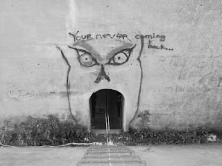
Pictured above: The entrance to a satanic temple, The Paulinskill Viaduct

Monday, April 12, 2010

Simply Awesome

Awesome. What else can I say? Every project presented was simply awesome. I say this because everything was fresh, outside our realm of knowledge, and enjoyable to watch/listen. And to top it off, everything related to the all-important theme of visual rhetoric. Each of us told a story through our images, and to me, we each effectively conveyed a message or story with the use or little or no words.

A few projects that are still lingering in my mind...

Julie's Story of a Writer, which should earn her an A in the class by itself. It was professionally executed, and resembled the example videos we watched prior to completing our assignments.

Sara's video montage of the 9/11 Teardrop Monument was a respectable, emotional timeline of the construction and appearance of an incredibly unknown tribute to those who died in the 9/11 attacks. The mix of music and images caught my eyes and ears and hooked me from the very beginning.

Though Matthew didn't believe his Meaning Making photos had the flash of some other projects, his theme of random things not often noticed or seen around Philadelphia was different from others, and some of the images were strange or odd enough to capture the essence of things we often miss everyday in our busy lives.

The Path of Estro

I've always had this odd dislike for corporate branding, and at some point years ago, I knew it was just a matter of time before it infected something important to me, such as running. It's not just an activity anymore though-- it has spawned a "lifestyle" of activewear clothing. No longer is a Nike headband used to soak up the sweat exerted during a draining exercise or sport-- it's part of a lifestyle of clothing, and it's now acceptable to where whenever.

Truthfully, there's nothing wrong with it, but for some reason, it just bothers me. Perhaps it's because the branding of myself isn't something I look to do while running. I don't need to show off a swoosh or set of stripes or Underarmor "U" because it doesn't help me-- what gets me to the finish line is my passion.

Coincidentally, the last photo of my essay reads the word, "estro"-- Greek for passion. It wasn't something planned, but as I laid on the gravel, and the shirt laid in front of me, I noticed just the estro of livestrong displayed. It was a pure coincidence, but fit the scene just right.

Below is my photo essay in full.


Monday, March 22, 2010

In Time, What It Is becomes What Is It?

Lynda Barry’s What It Is is what I needed, as a writer and as a maturing adult. I’m a believer that as we grow older, we leave behind the playful antics of our childhood, and we become caught in-between the harsh responsibilities and realities of life. And in doing so, we sometimes look at existence as more of a burden than anything.

But when you’re an artist, I think there’s a struggle.

There’s a tug-of-war between our imagination and what’s truly happening in this world, and though we are all pulling on the side of the imagination, sometimes reality wins, and we forget about the things that made us writers, like our dreams, our childhood fears, and what we cooked up in our minds. When I read through What It Is, it reminded me of my own childhood, one page after another, and what led me to becoming a writer. I, for one, never want to truly grow up, and I cling harder to my childhood probably more than anyone I know. If I could, I’d wear onesies all day.

But I can’t.

I have responsibilities, like a job, and sometimes, they keep me from releasing some amazing ideas—like wearing onesies all day. In a more serious tone though, Barry’s book brought me back to my childhood, and posed questions that I haven’t thought about since I was a child—such as. “What is fog?” on page 139 or “What would you like to be good at?” on page 74.

I suppose that in a weird way, Barry’s words and illustrations help me access an area of thought I haven’t been to in quite some time; and unfortunately, these questions are harder to answer now than if I were 7 or 8 years old. From a writer’s perspective, answering “What is fog?” now wouldn’t capture everything my imagination was once capable of.

But I suppose I shouldn’t let that stop me from trying.

Photo: Courtesy of Edupics

Thursday, March 11, 2010

First Attempt at Electric Images

Some electric images I created recently; though for some reason, I'm having major trouble with sizing. I'll see what I can do about that.

The picture above was actually edited in Adobe Photoshop. One of my favorite music albums of all time is Something Corporates "North" and the cover was created in the same light with the actual picture being masked by a few like colors as if it were painted that way. The picture, for those wondering, is actually me receiving a trophy for winning a pillow fight tournament. It's a roadside traffic cone.


I love going on urban exploration trips, and this picture is the graffiti over the entrance to a satanic temple in New Jersey. I used sumopaint for this one, and I used the negative of a half-tone scheme with a squared pattern. I may change it though, because it doesn't capture the writing on the wall, which says, "You're Never Coming Back."

This is from another urban exploration trip I recently went on. It's the road sign on Shades of Death Road. I can't seem to remember the scheme I used in sumopaint, but it wasn't the negative. I'll keep looking.

This the outside of the satanic temple, which is actually located in a viaduct, which is a hollowed bridge with catacombs and rooms inside. I'm still playing with this, so I'll post a new version before class on Tuesday.


Copyright 2009 the flux. Powered by Blogger
Blogger Templates created by Deluxe Templates
Wordpress by Wpthemescreator